American Addiction Centers
Problem
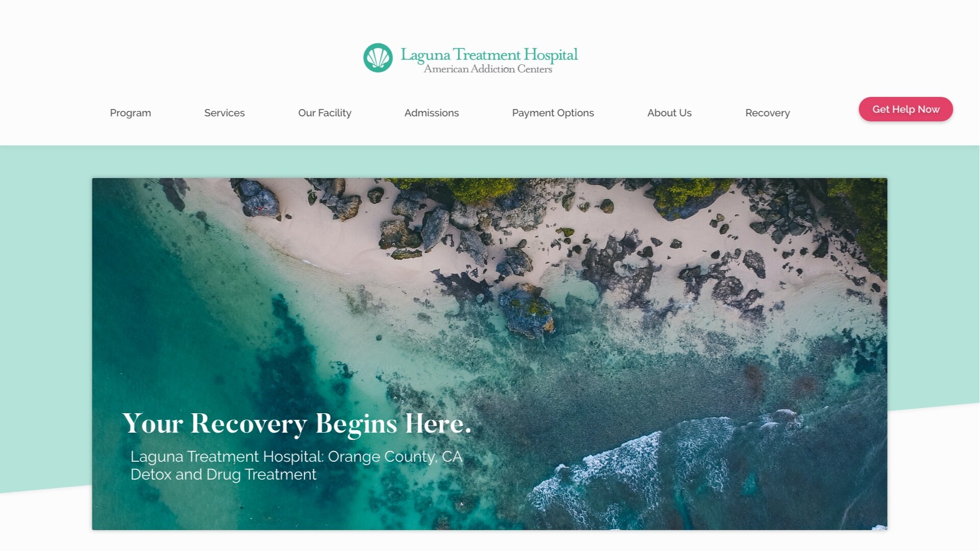
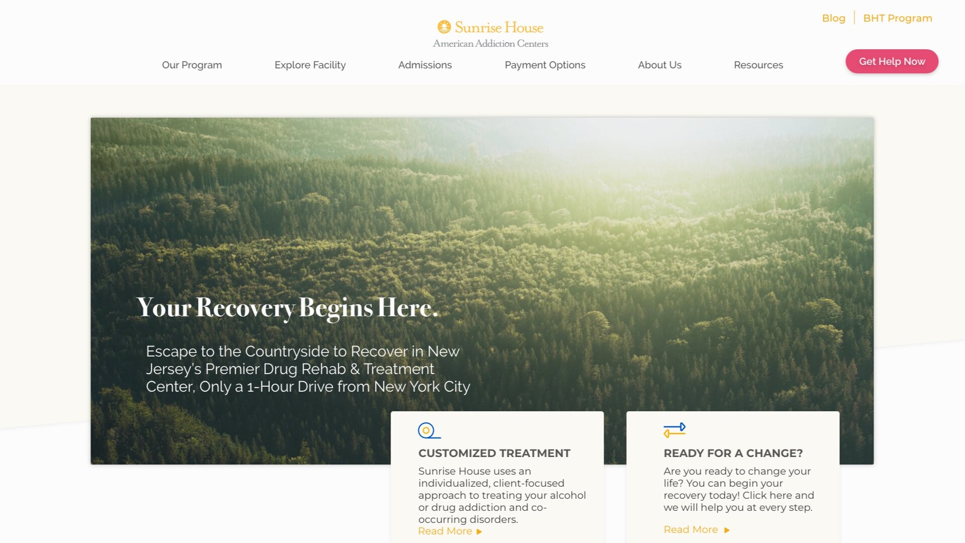
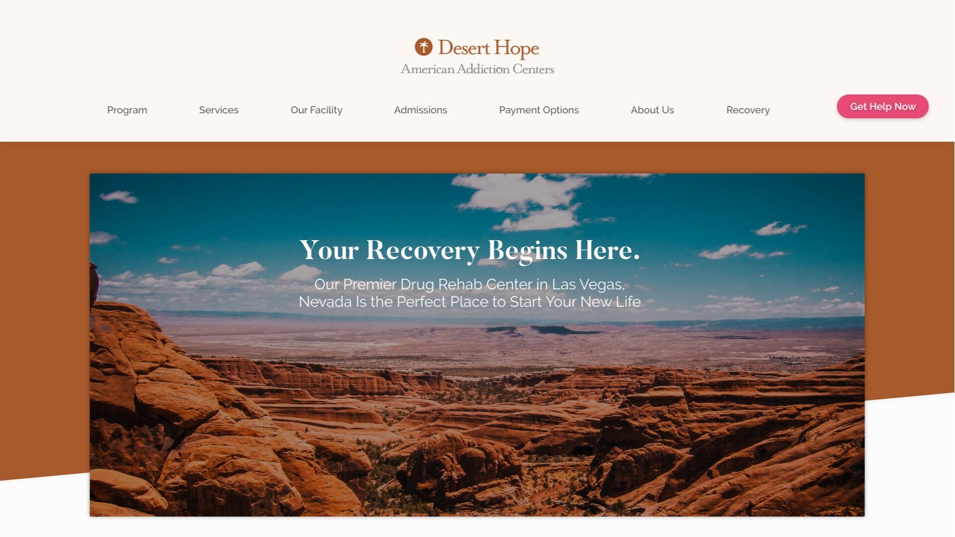
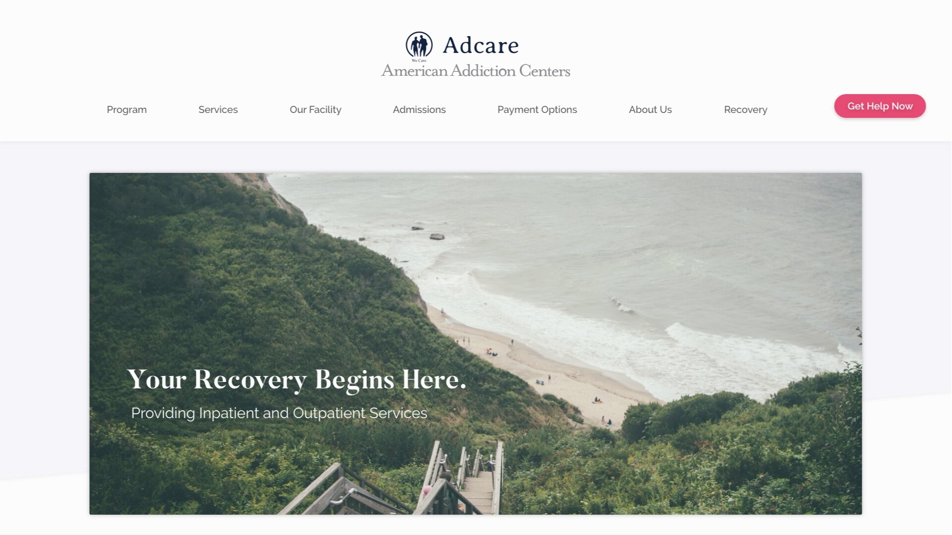
My job was to give the current American Addiction Centers websites a visual redesign. The aim of the design was to increase site traffic, conversions with clear call-to-actions, and an overall visual aesthetic that would create a more pleasant user experience. Each site had subtle differences so the aim was to create a series of design changes that made all the designs feel cohesive and aligned to the brand. Design constraints within a Wordpress template limited the designs with regards to layout, but otherwise I had creative liberties to create a new visually impactful site.
Solution
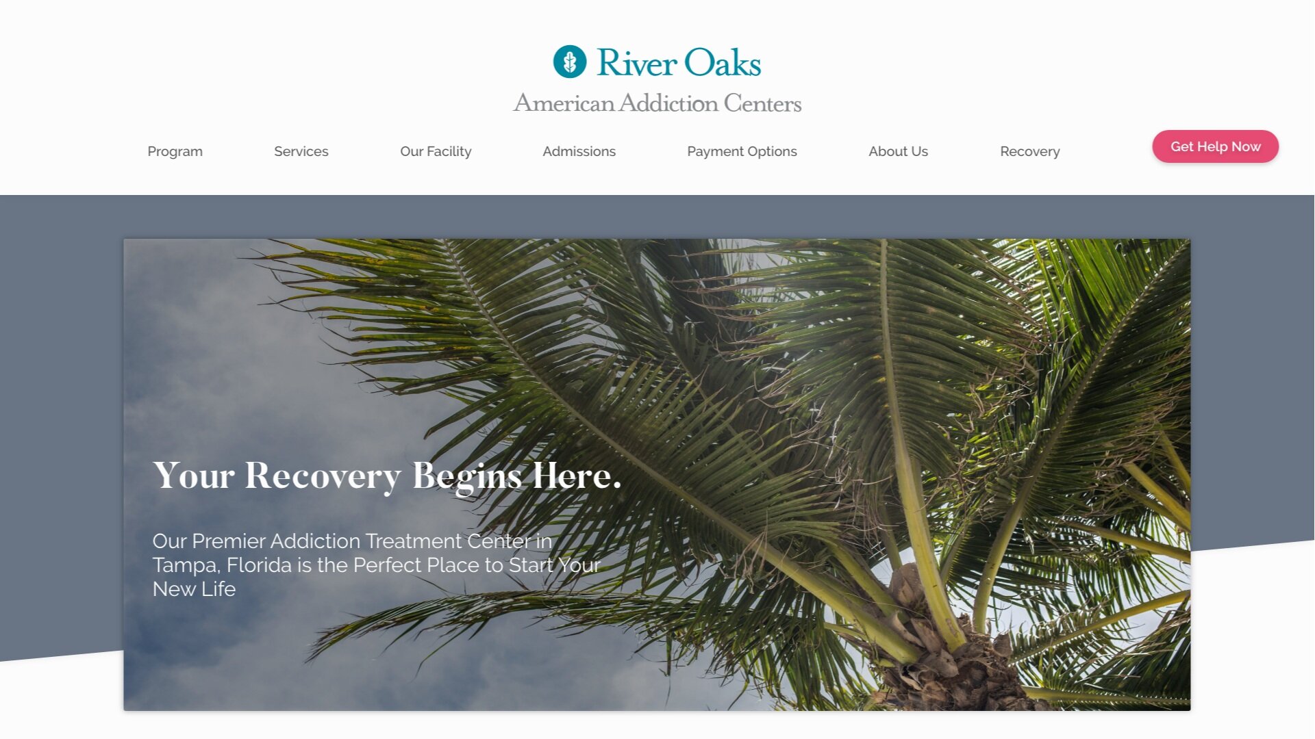
The client asked for 3 variants of different designs initially, but decided to move along with the first set of designs that I mocked up. With the design I was going for a minimalist aesthetic that would allow the user to intuitively navigate throughout the pages as well as making CTA’s clearly visible, and effective use of negative space to let the site “breath” so-to-speak.
Landing Page Designs
Content Pages
Click through the buttons to view the various content pages that were designed
